Why Norwegian Cruise Line’s Brand Suddenly Looks Different
If you’ve been scratching your head over Norwegian Cruise Line’s recent ads and marketing, you’re not alone. Since the New Year, the cruise line quietly changed its logo to black and rolled out ads that felt more artsy than informative. Today, they finally explained the shift.
Now we finally have the answer.
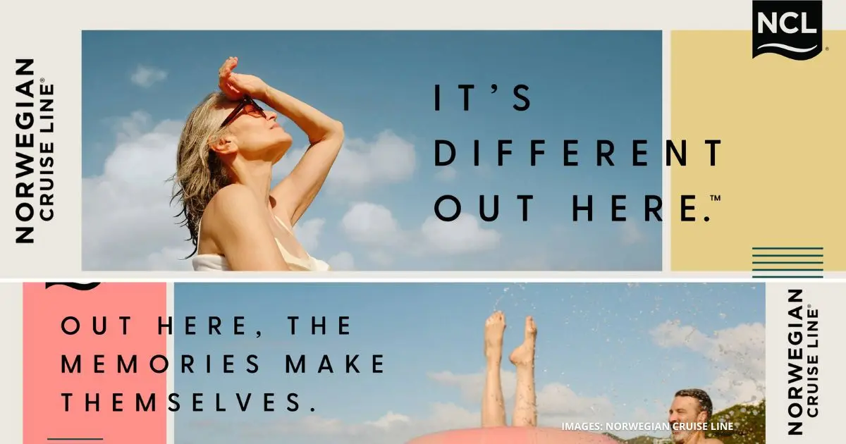
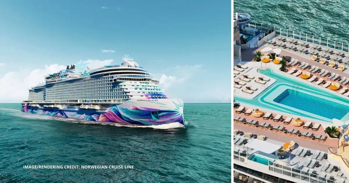
Norwegian Cruise Line has launched a new brand campaign and refreshed its overall look, built around a familiar tagline from its past, “It’s Different Out Here.”
This isn’t a random throwback. The tagline dates back to the 1990s, before cruising became a race to build the biggest ships and pack in the most onboard attractions. By bringing it back now, Norwegian is repositioning itself around something it has leaned into for decades: flexibility.
That idea connects directly to Freestyle Cruising, which Norwegian introduced in 2000 by eliminating fixed dining times, rigid schedules, and formal dress codes. The new campaign builds on that same philosophy, focusing less on what’s on board and more on how cruising actually feels.
The centerpiece of the rollout is a national TV spot called For All Maritime. It’s intentionally different from a typical cruise commercial. Instead of fast cuts of waterslides and restaurants, the ad takes a more cinematic approach, tracing the idea of freedom at sea across different eras and spotlighting travelers who didn’t fit into strict traditions.
That tone carries across the rest of the campaign, which spans social media, digital platforms, radio, and outdoor advertising. Visually, the brand feels calmer and more open, with ocean and sky replacing crowded onboard scenes.
Looking back, the rollout makes more sense now. The unexplained logo change, the vague visuals, and the unusual ads weren’t intended to tease a new product. They were setting the stage for a broader brand reset.
The updated version of It’s Different Out Here feels very different from the original 1990s campaign. Where the earlier ads leaned edgy, this one feels more relaxed and reflective, aimed at travelers who value flexibility and time over packed schedules.
In a cruise industry that often feels louder and more crowded every year, Norwegian Cruise Line is making a simple point. Cruising doesn’t have to feel that way.
And yes, that’s why the logo went black — along with a softer, more muted look overall.
Images and videos courtesy of Norwegian Cruise Line.
Kathy Ava
Meet Kathy Ava, a food, travel, and cruise writer based in Los Angeles/Pasadena, and the owner and main writer of Tasty Itinerary. With over 20 years of experience planning trips and logistics at her full-time job and for herself, she's become a pro at crafting unforgettable tasty itineraries. She's always on the hunt for delicious, fun travel destinations and cruise itineraries. She firmly believes that life is short and we must make the most of it, so always say yes to dessert.